Colour Palette
In this I will research some colour palette examples and decide my own colour palette. In my project I want to make my cafe warm and comfortable for costumers and also outstanding with colouring and decorations. There is some key points to choose correct colour palette for project. Balancing colours is the most important key for creating colour palette. Using a mix of light and dark shades to create depth and interest. Too much of one can overwhelm the space (piktochart).
Here some coffee shop colour palette examples;


All these colour palettes are really good examples for cozy, warm and comfortable cafe design. However I want more eye catching and attractive design for costumers which my target audience is Gen Z and I will design in postmodern style. So I looked for brighter colours to add my colour palette. I will keep on my mind balancing the colours so I will use also these warm colours and add one or two brighter colour to encolour to cafe.
Also colours has a physiological impact on our eating and drinking habits. For example, red is hungriest colour. Studies have shown that the colour red attracts our attention and increases our energy. Numerous studies have shown that red subconsciously encourages people to eat more and consume food faster, especially when paired with cheery yellow (wasserstrom, 2022). Because of that it mostly used in restaurant and fast food chains.


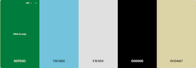


And this is my final colour palette for this project.

Piktochart Team, 2024 The Best 15 Coffee Shop Color Palette Combinations ' Tips For Creating Coffee Shop Color Palettes ' piktochart.com Available at: The Best 15 Coffee Shop Color Palette Combinations (Accessed: 13 May 2025)


Now that you have decided on a colour palette, start applying this to your designs.
ReplyDelete